ARIA Mistakes to Catch in Web Components
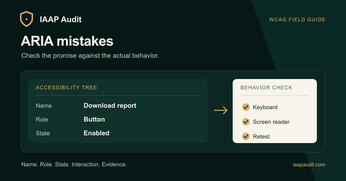
Adding role="button" to a div can change its announced role. It does not provide the browser behavior of a native button. The component still needs keyboard activation, focus handling, and a meaningful name.
That distinction is worth building into your design system review. A component API should produce an experience that matches what it advertises to assistive technology.
Prefer semantics that come with behavior
For an action, reach for <button> when it fits. For navigation, use a link. Custom roles are valuable for patterns without an adequate native equivalent, but they add obligations the browser will not implement for you.
The W3C ARIA Authoring Practices Guide calls a role a promise. Test that promise in a rendered page. A component story that looks right with a mouse is only one part of the evidence.
Make the exposed state share a source of truth with the UI
If an accordion opens, the triggering button's aria-expanded value should reflect that change. A disclosure can start closed and become open through the same state that controls panel visibility. W3C's disclosure pattern specifies the open and closed state behavior; aria-controls is optional for this pattern.
The difficult cases often arrive after composition: a parent controls visibility, a child owns the ARIA attribute, and they drift after an asynchronous update. Check both transitions, including when content loads or a route changes.
Inspect hidden content and dialogs in context
aria-hidden="true" removes content from the accessibility tree, but does not itself prevent keyboard focus. A hidden panel with a focusable child can leave a keyboard user on an unnamed target. Verify whether the underlying DOM and focus order reflect the visible state.
For a modal dialog, setting aria-modal="true" is also only a declaration. The page behind it must be unavailable while the modal is active, focus needs to enter the dialog, and users need a reliable way to exit. See the W3C dialog pattern for the expected interaction.
Review an assembled route
Use this sequence on a representative page:
Inspect the computed accessible name, role, and state.
Operate the control with keyboard and pointer input.
Compare visible changes with announced changes.
Check whether inactive content remains focusable.
Test at least one route where the component is reused.
Record the component state and actual result. That helps distinguish a Web Content Accessibility Guidelines (WCAG) conformance issue from a code warning that needs more context. It also gives engineers a clear retest target.
Read the original guide on IAAP Audit: https://iaapaudit.com/blog/aria-mistakes-accessibility-audits